Venster
Concept, Branding, Website
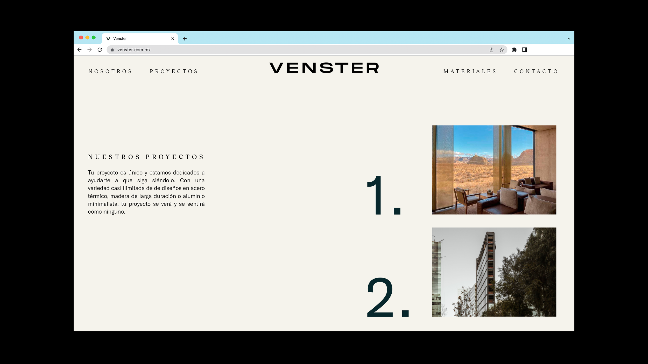
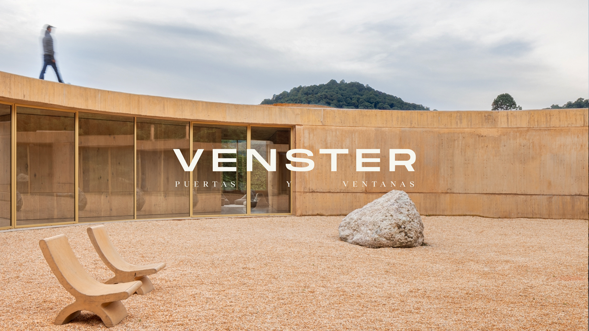
Venster Windows: Solid Geometry
The identity for Venster Windows was conceived around the very product they offer: high-quality, solid, and elegantly structured windows. The logotype and overall visual system draw inspiration from the rectangular geometry of their windows, emphasizing solidity, minimalism, and clarity.
The result is a brand that feels premium and architectural: built to live comfortably in both design-forward environments and technical, construction-based contexts.


Venster’s challenge was to reflect the high-end nature of their product without losing accessibility. The brand was designed to sit effortlessly on a luxury home brochure, a construction site helmet, or a supplier’s uniform. From typography to layout to applications, every element was calibrated to balance refinement with practicality.