Tatine
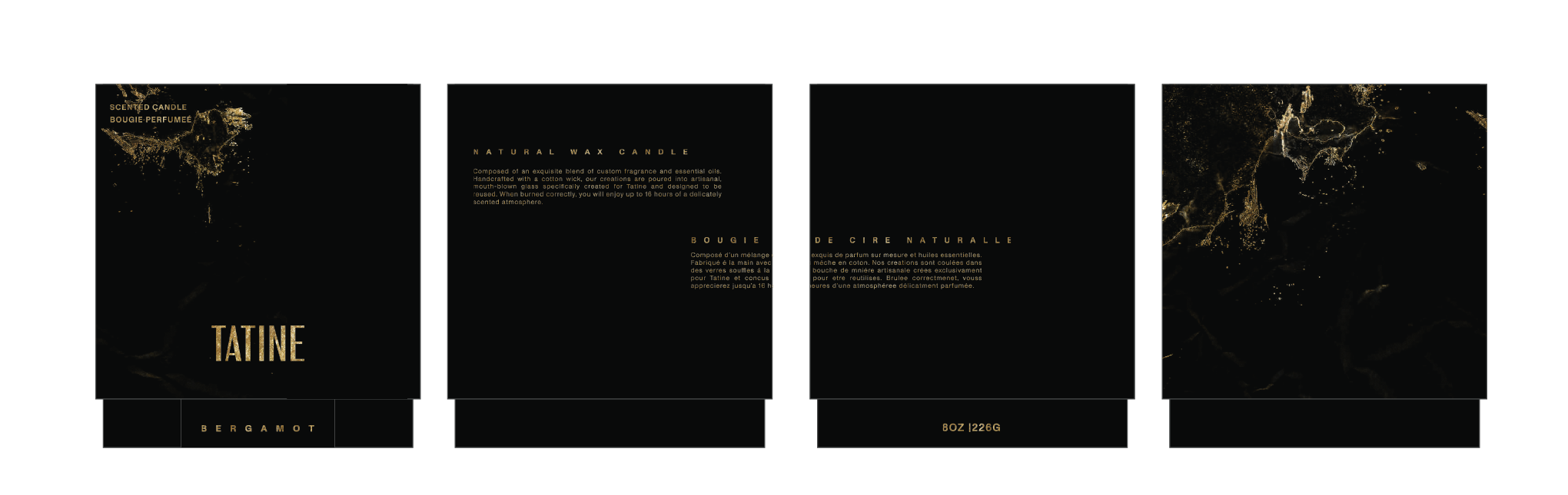
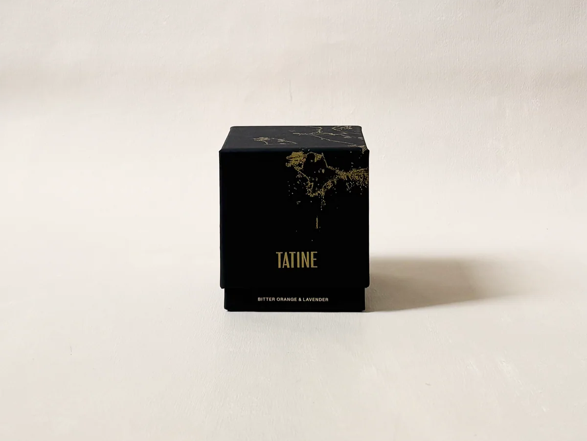
Rebranding and box design. work done w/savvy studio
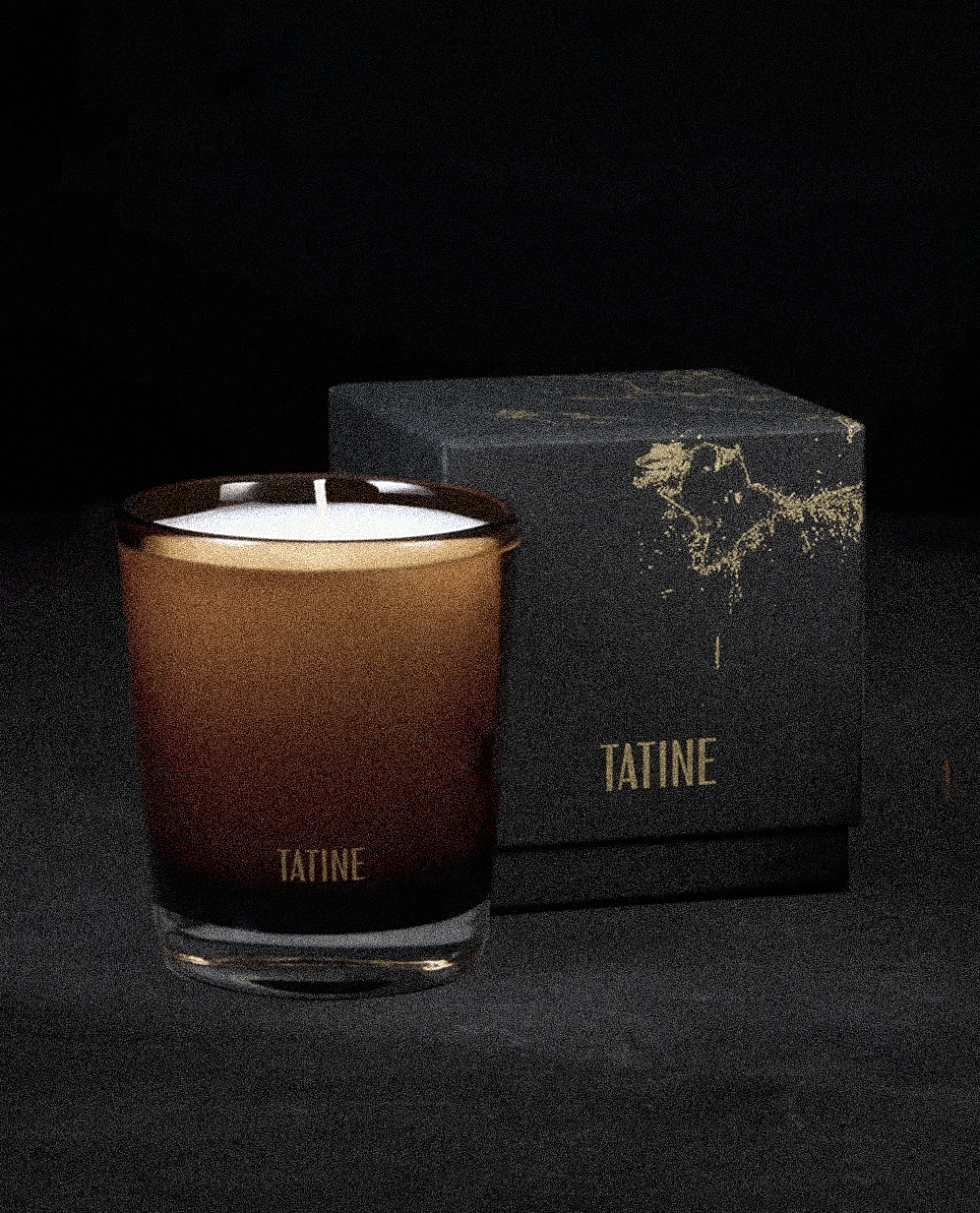
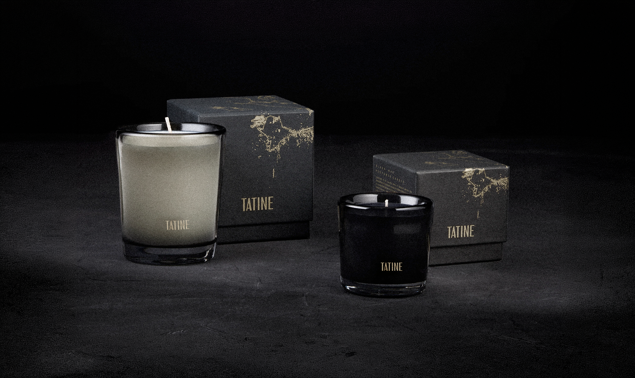
Product photos from Tatine’s website
Abstract Intensity
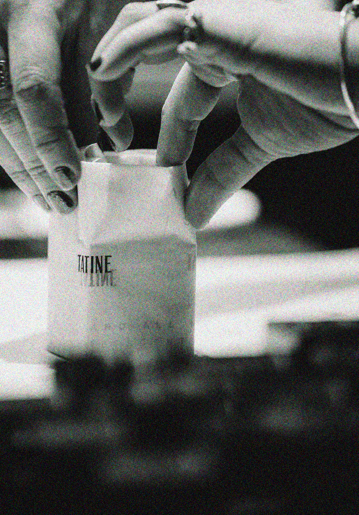
Tatine’s motor has always been emotion; from creation to consumption, their products are full of inspiration. The main focus when making their rebranding was adjusting the tone and depht of the brand.
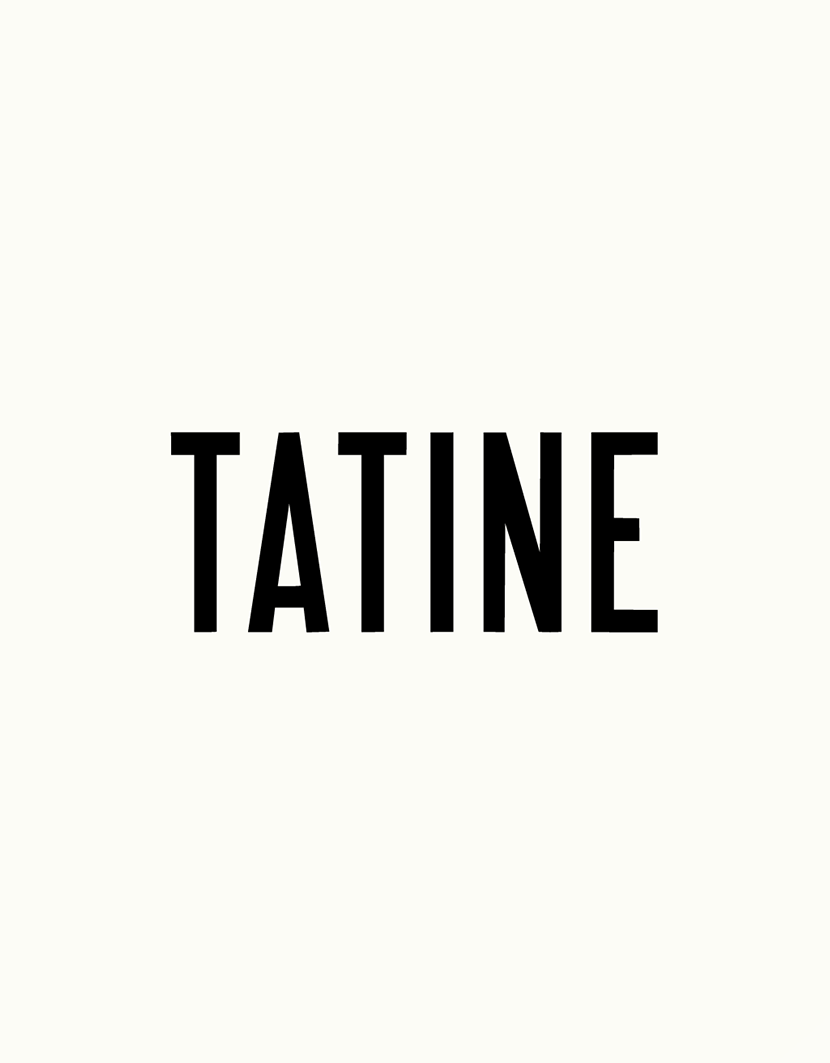
The previous logotype felt heavy and rigid, slightly misaligned with the brand’s delicacy and its strong connection to art, atmosphere, and abstraction. We refined the type by adjusting proportion, contrast, and rhythm to introduce air and verticality.
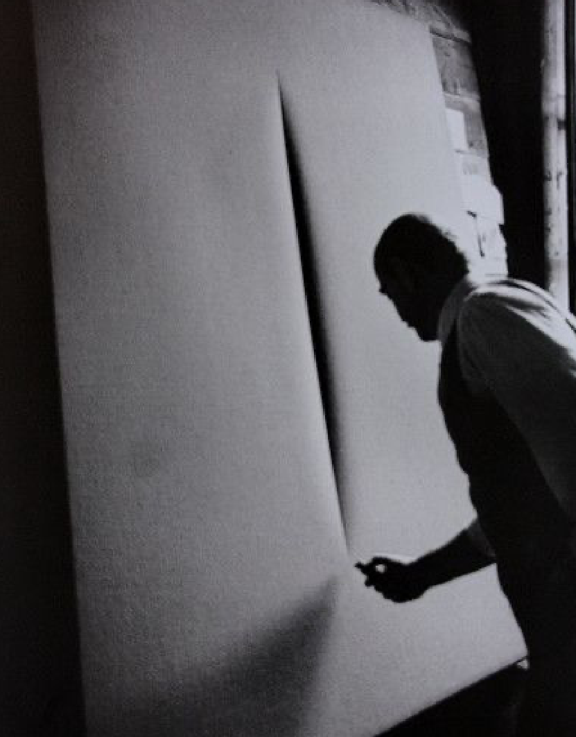
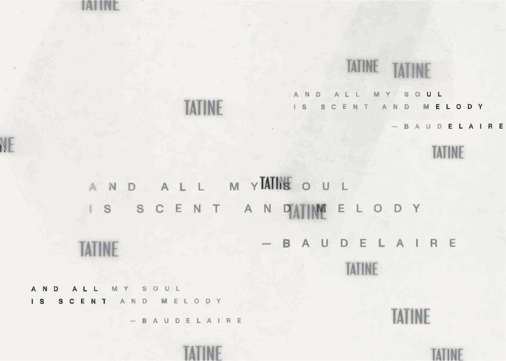
The conceptual direction was deeply inspired by material transformation and the Dada movement from Yves Klein’s fire studies to Man Ray’s radiographic imagery and Lucio Fontana’s visceral surfaces.
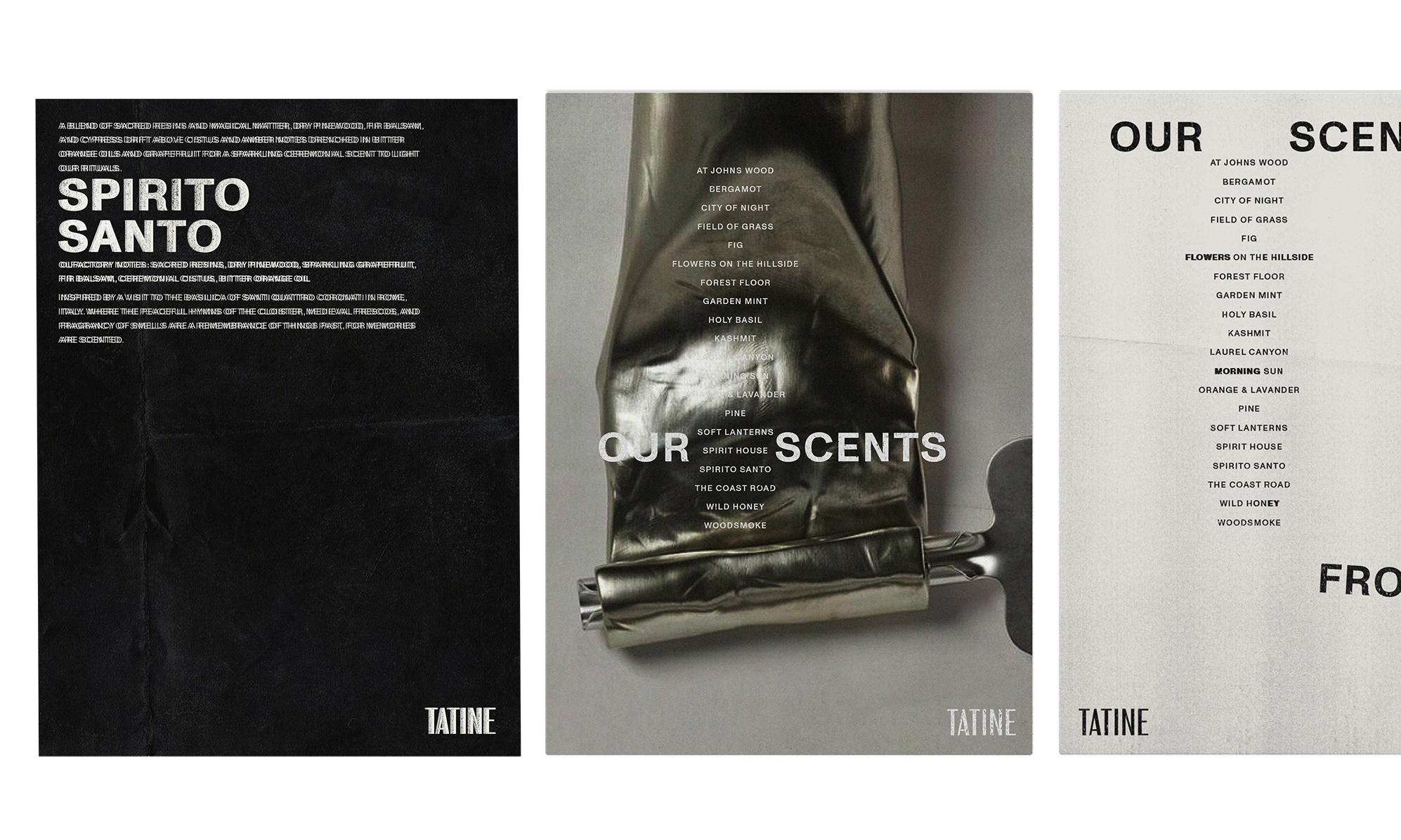
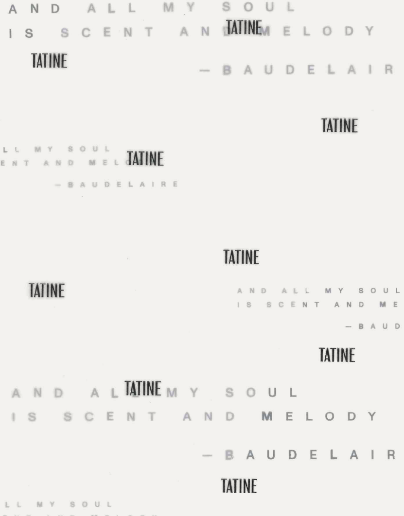
The typographic system is built around Monument Grotesk (neutral and structurally precise, allowing room for controlled intervention). In select applications, type is distressed or interrupted, echoing the tactile irregularities present in the broader visual language.
Worn textures and abstract marks appear in moderation, creating tension between refinement , delicacy and emotion.
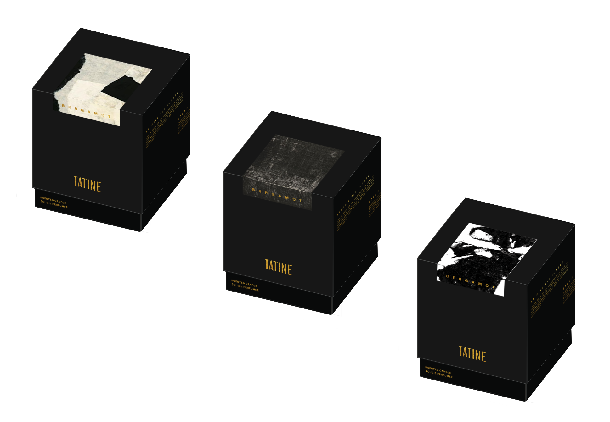
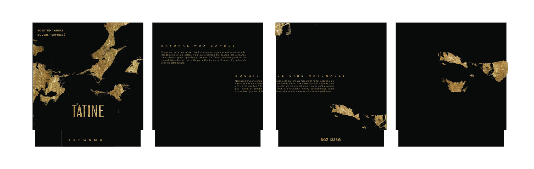
Packaging became a space for graphic exploration: a series of ink experiments led to a dusty golden surface finish. Layouts are designed to move gently across the surface while mantaining legibility.
The result is a system that feels lighter, more dimensional, and aligned with Tatine’s sensibility.