Rondevous
Logo Design and Branding with Kuba
Cosas que Regresan
Rondévous is a curated second-hand space based in Zurich, built around the idea of circulation (of objects, of meaning, of things returning in new forms).
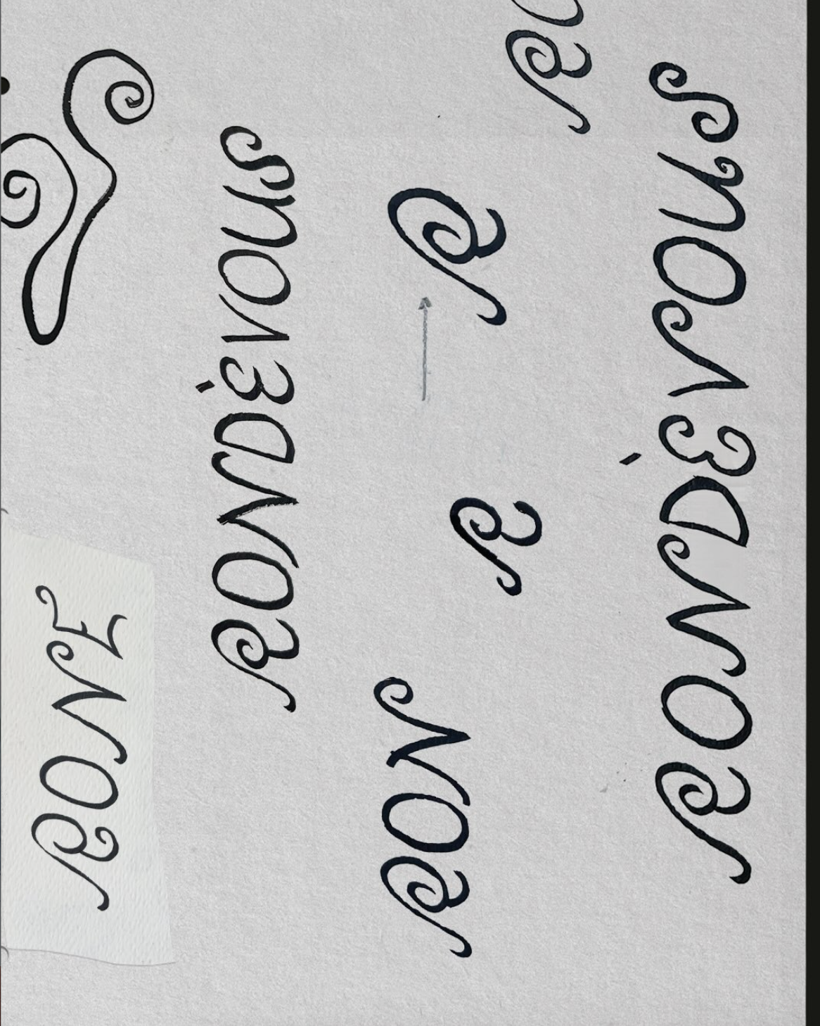
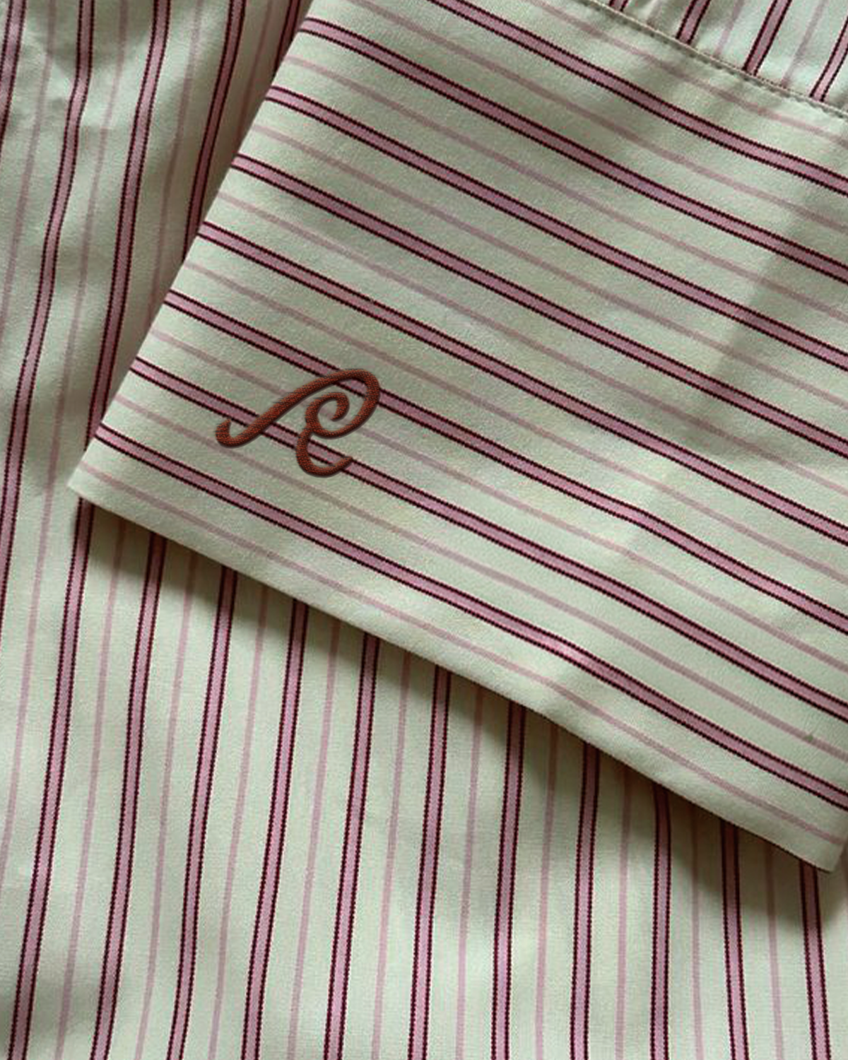
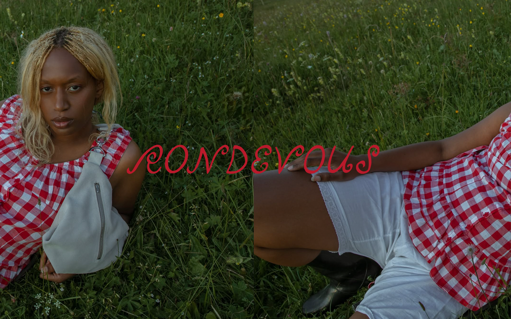
I developed the logotype as a fluid, expressive gesture, introducing spirals and subtle irregularities that evoke movement, continuity, and transformation. The letterforms carry a sense of rhythm and return — a visual language aligned with the idea of “cosas que vuelven a ser.”
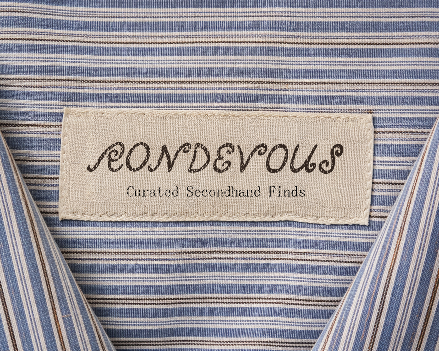
The resulting type feels open, slightly romantic, and intentionally unpolished.
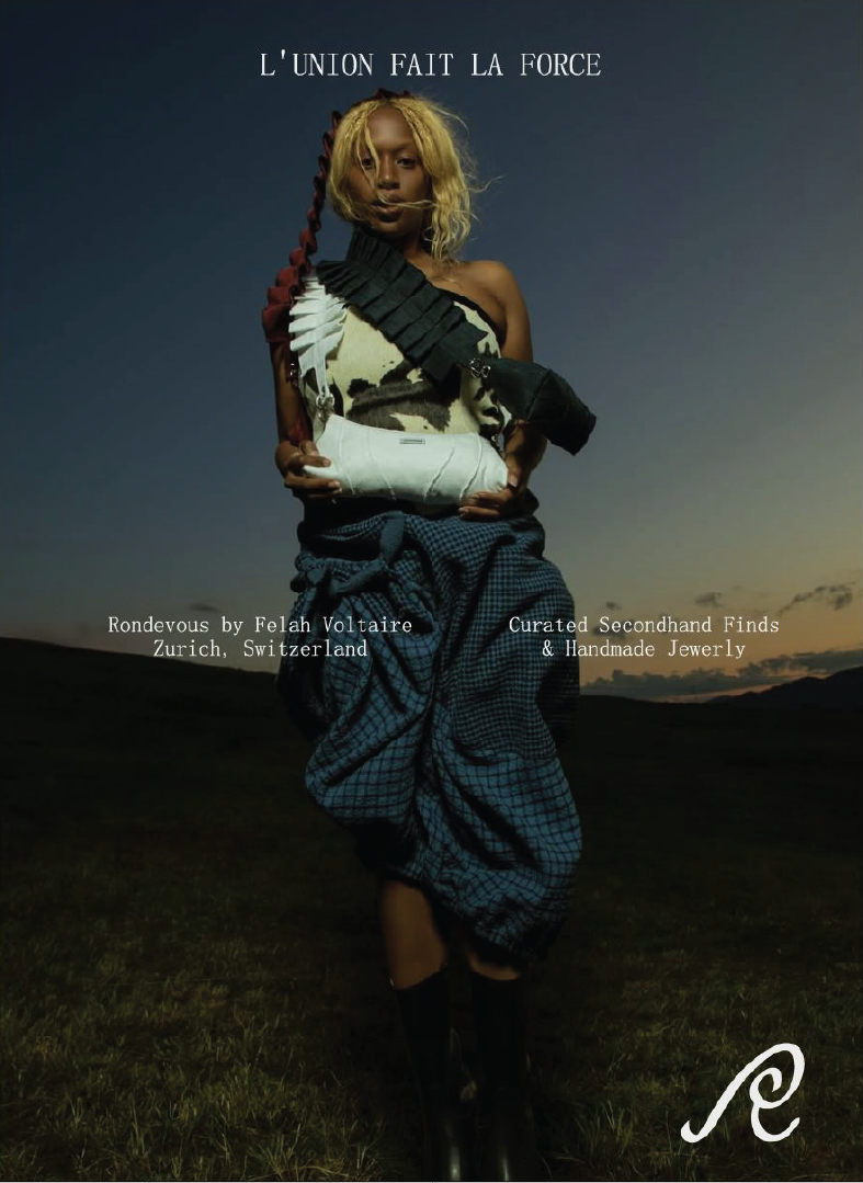
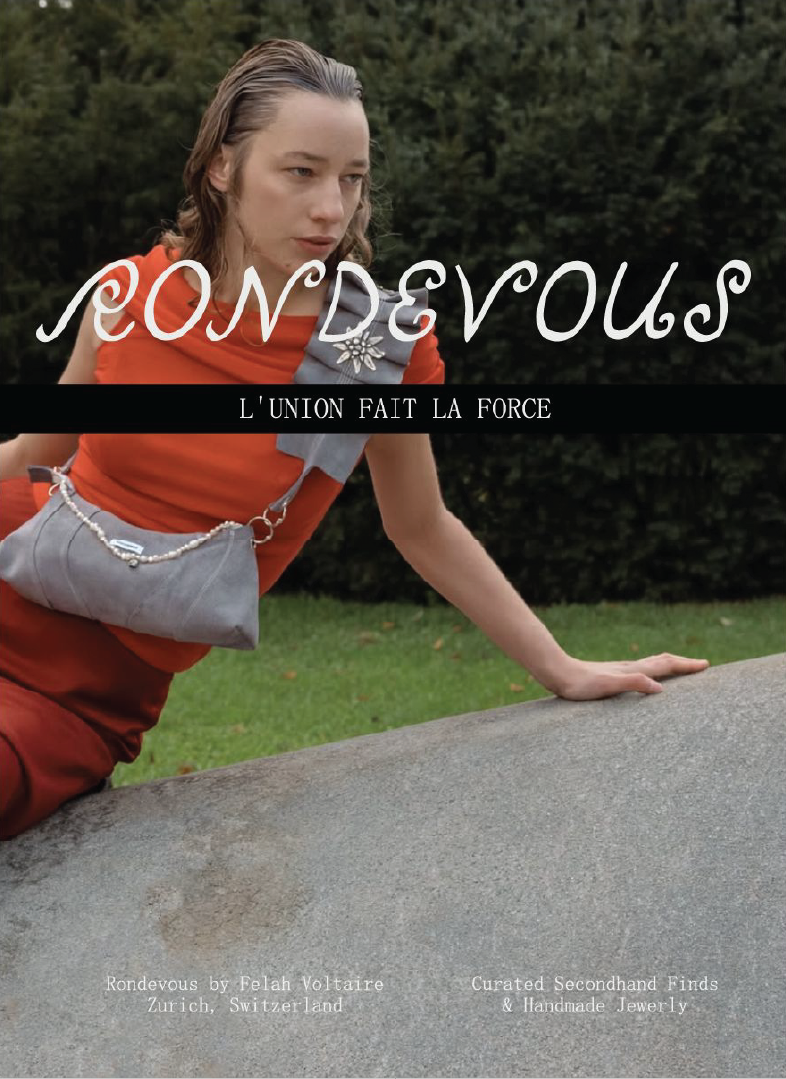
The broader identity, developed in collaboration with Kuba Creative Services, balances this softness with a contrasting typographic system: a narrow monospaced typeface that introduces structure, tension, and clarity.
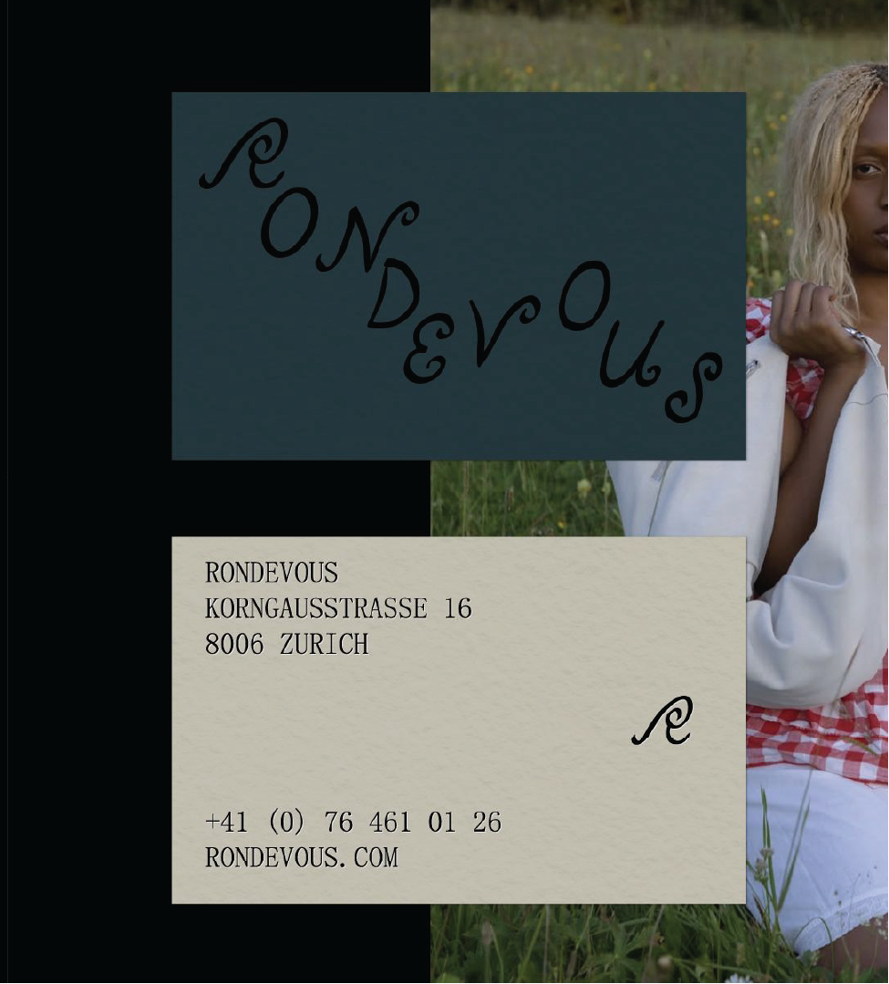
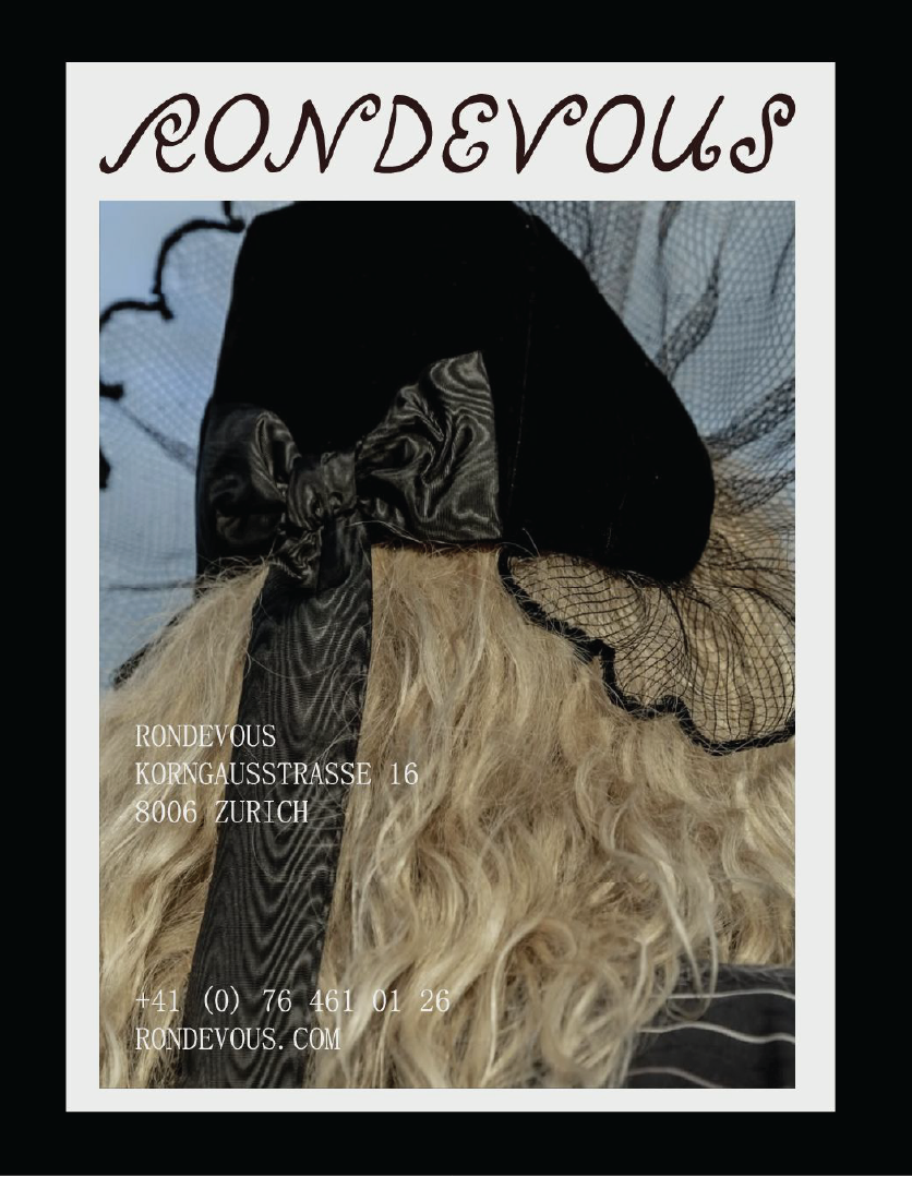
Together, these elements create a system that feels both playful and grounded: contemporary, but with a sense of ongoing motion.