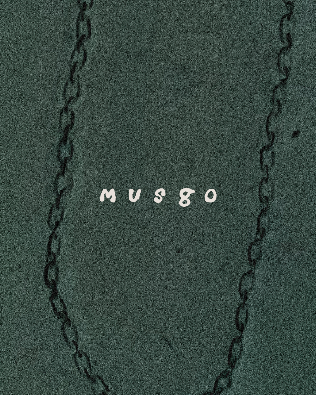
Musgo
Branding & Art Direction
Shape & Contrast
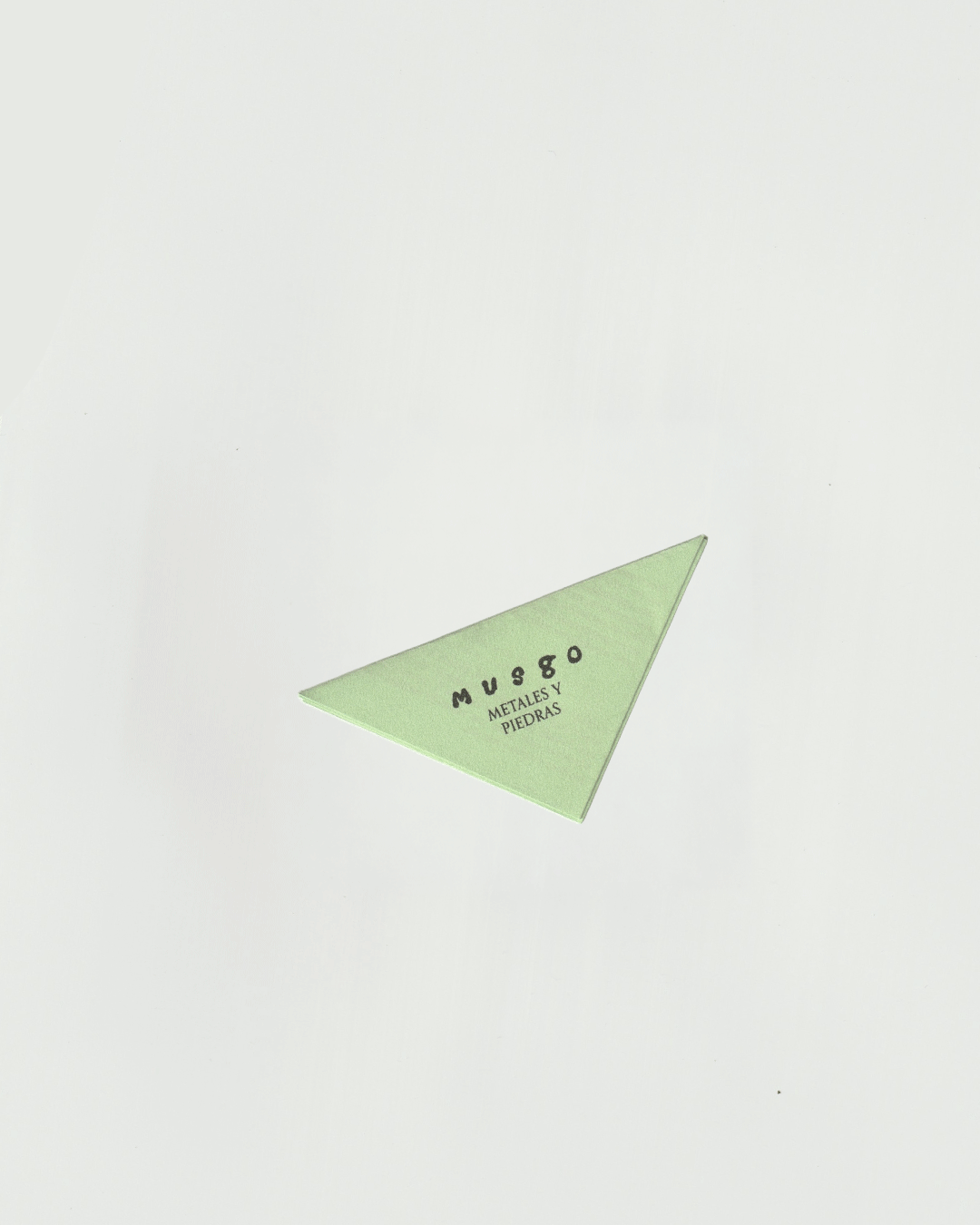
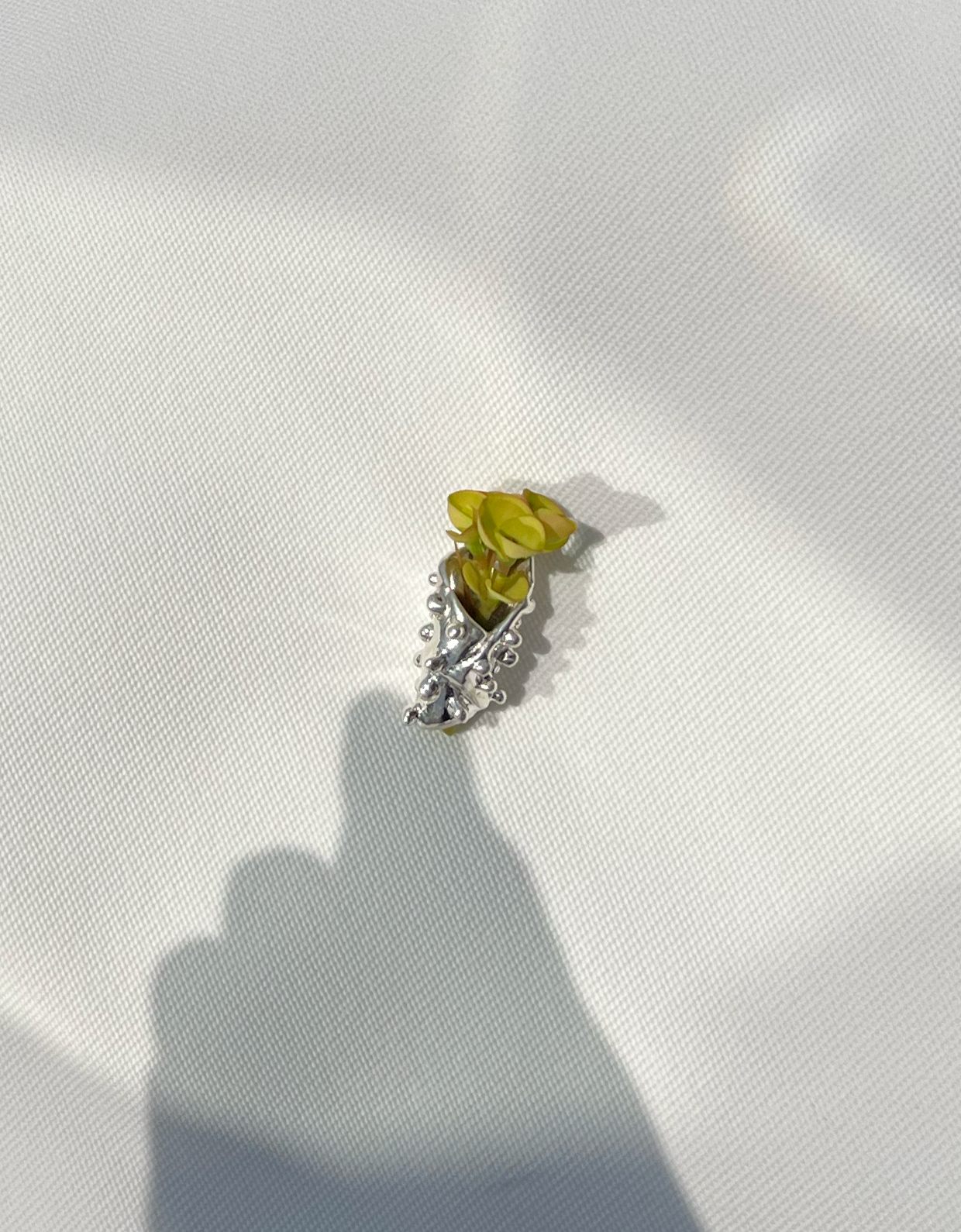
For the branding development, the name Musgo (moss) became a key point of departure, alongside the jeweler’s personal interests and aesthetic sensibilities. An organic, irregular form immediately came to mind: one influenced by the owner’s affinity for skate culture, film, mushrooms, nature, and the outdoors.
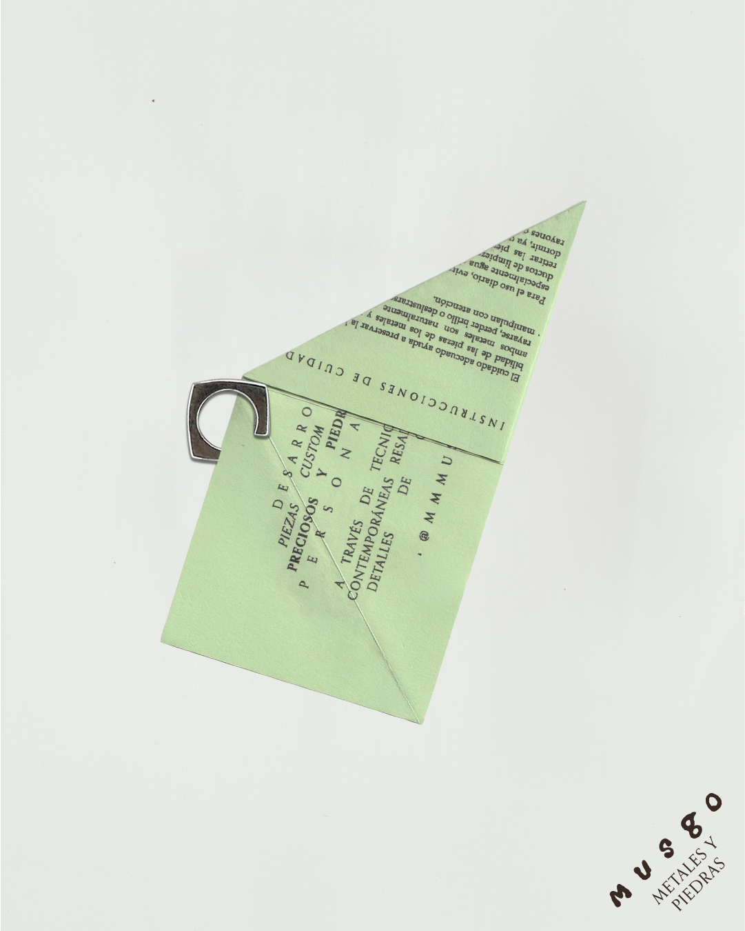
The identity was anchored by a direct and grounded tagline. Rather than opting for something expected such as “custom jewelry,” Metales y Piedras was chosen. Its simplicity highlights the natural properties of the materials themselves, reinforcing the project’s connection to the earth and its elements.
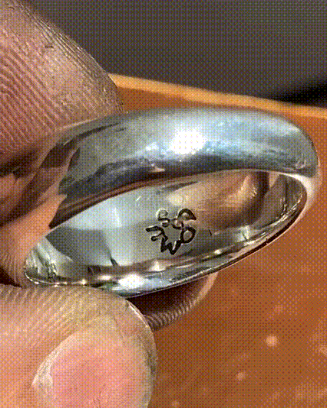
At the same time, the brand needed a layer of refinement that could communicate the quality of the materials and the fact that each piece is custom-made and one of a kind.
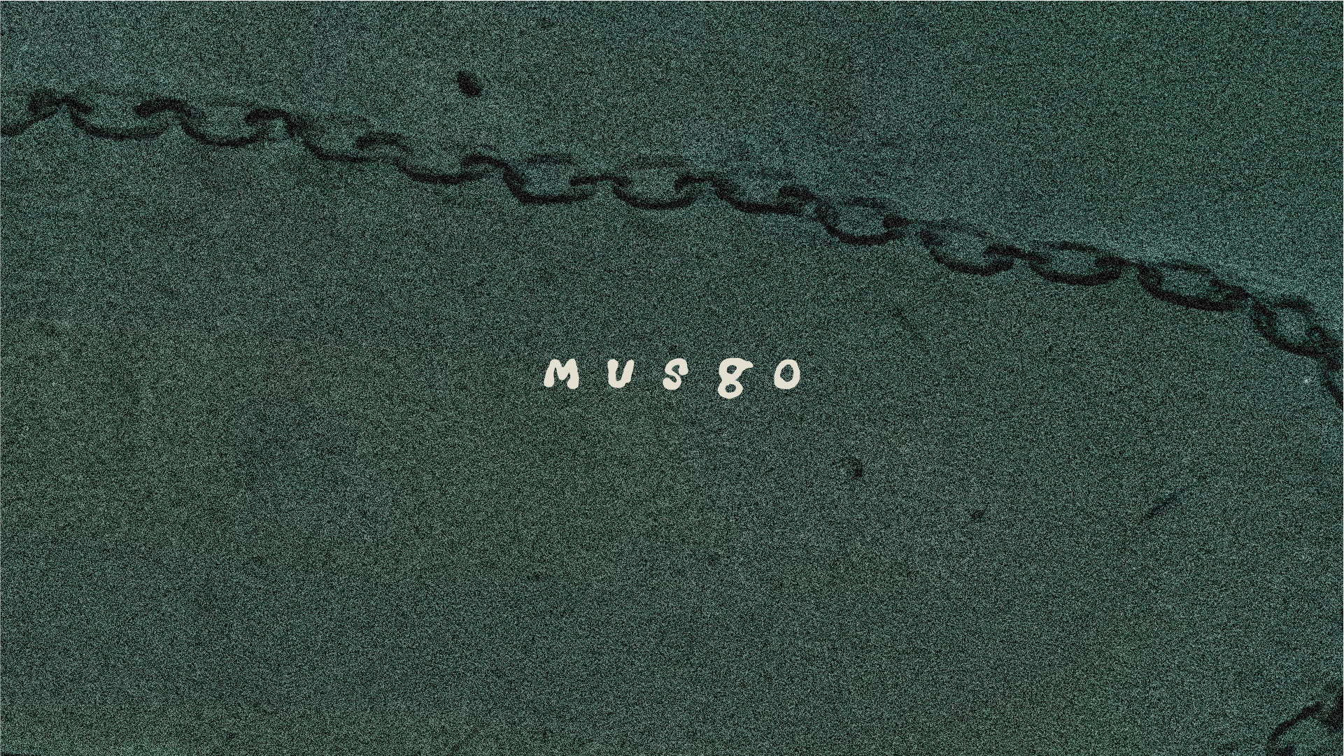
The Orpheus family was introduced to contrast the organic nature of the logo and elevate the overall identity. A monospaced typeface completes the typographic palette, pulling the system in three distinct yet complementary directions that together create a cohesive visual universe.
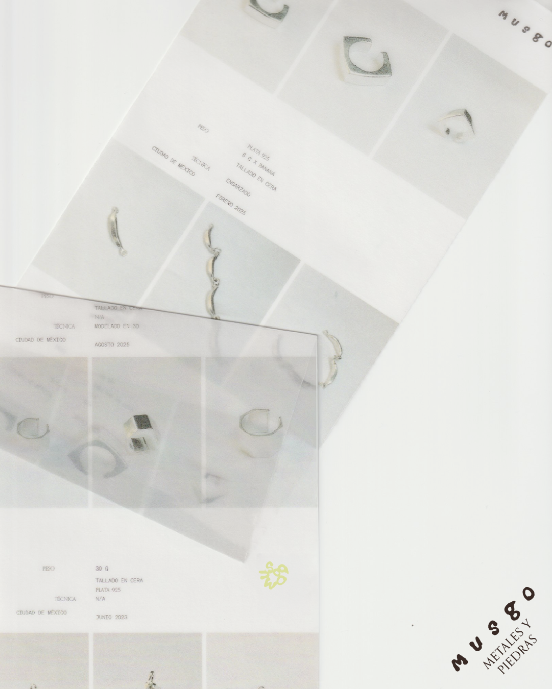
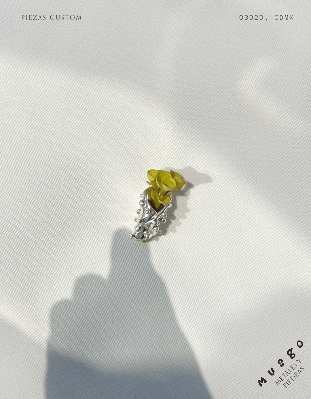
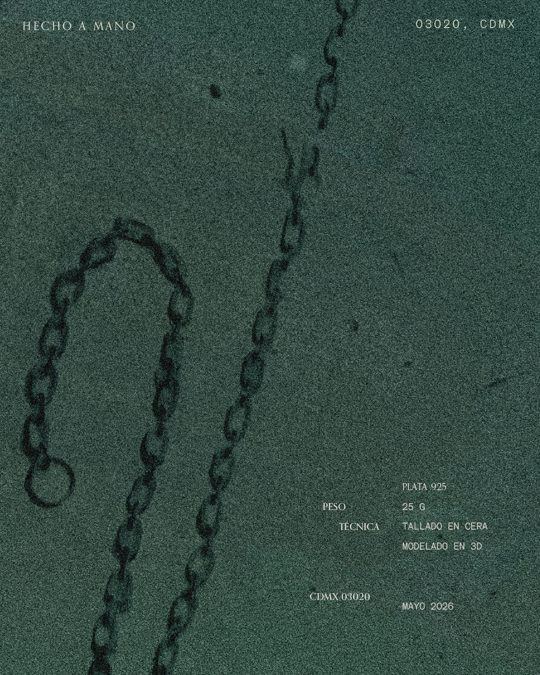
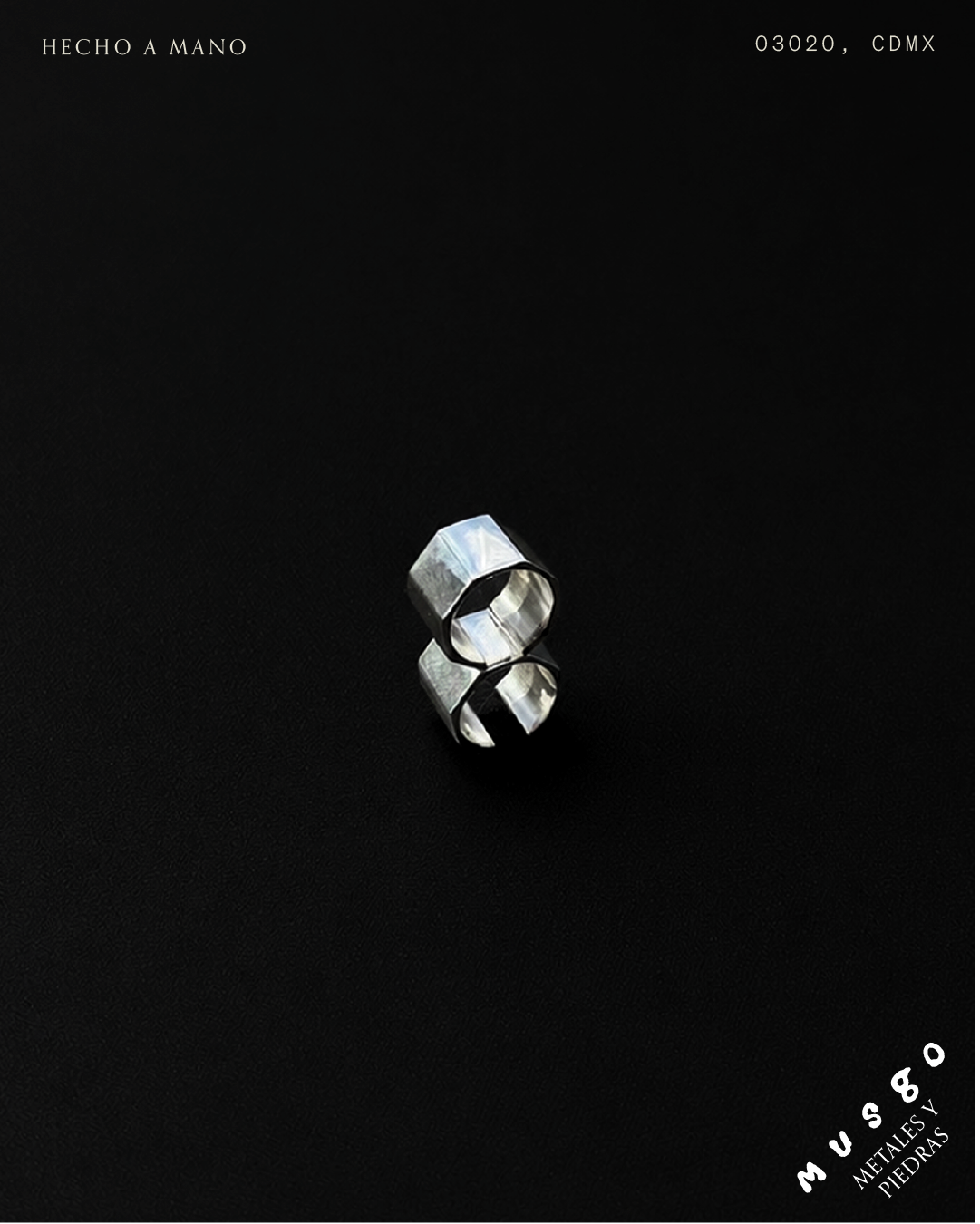
Materiality was also an important aspect of the project. Thoughtfully designed printed collaterals helped extend the identity into physical form.
The typography is strong and serious, balanced by fluid yet carefully structured compositions and geometric placements. This tension between rigor and spontaneity reflects the essence of the brand itself.