Her Place
Concept, Branding, Packaging
Work made @Savvy Studio
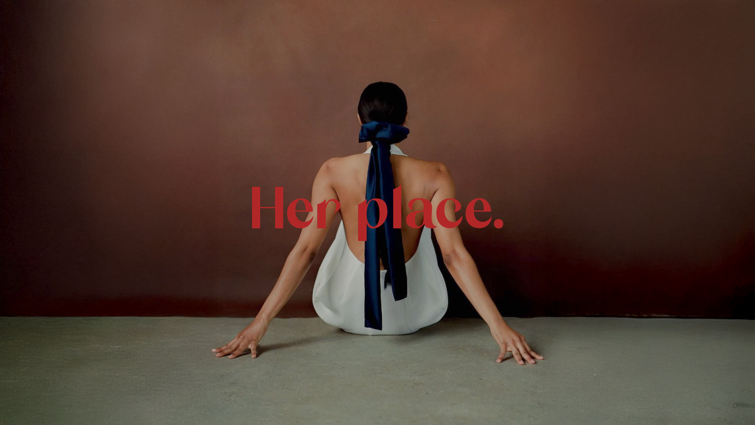
Her Place was born from creator Joyce Lee’s desire to express different forms of femininity, uniting them through rituals of self-love, sexual expression, and liberation.

The brand carries a strong sense of romance — reflected in the logo’s curvy yet sharp typeface and the ribbon-like monogram. The graphic identity nods to blood and all it symbolizes for women: connection, emotion, and transformation.

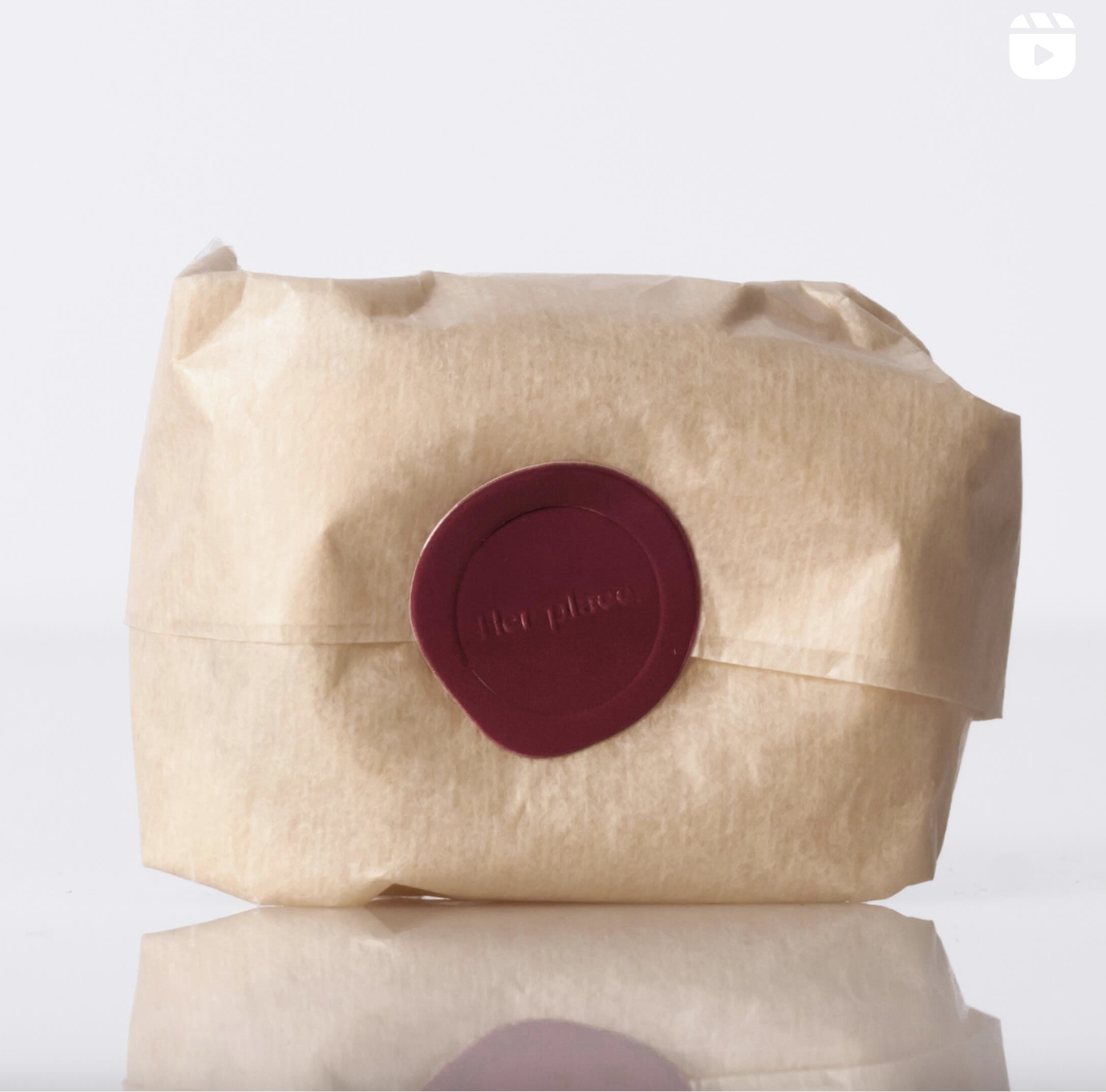
Packaging was designed to feel intentional and honest — beautiful without being overwhelming, and never artificial. Every detail was carefully considered to reflect the brand’s values and intimacy.


