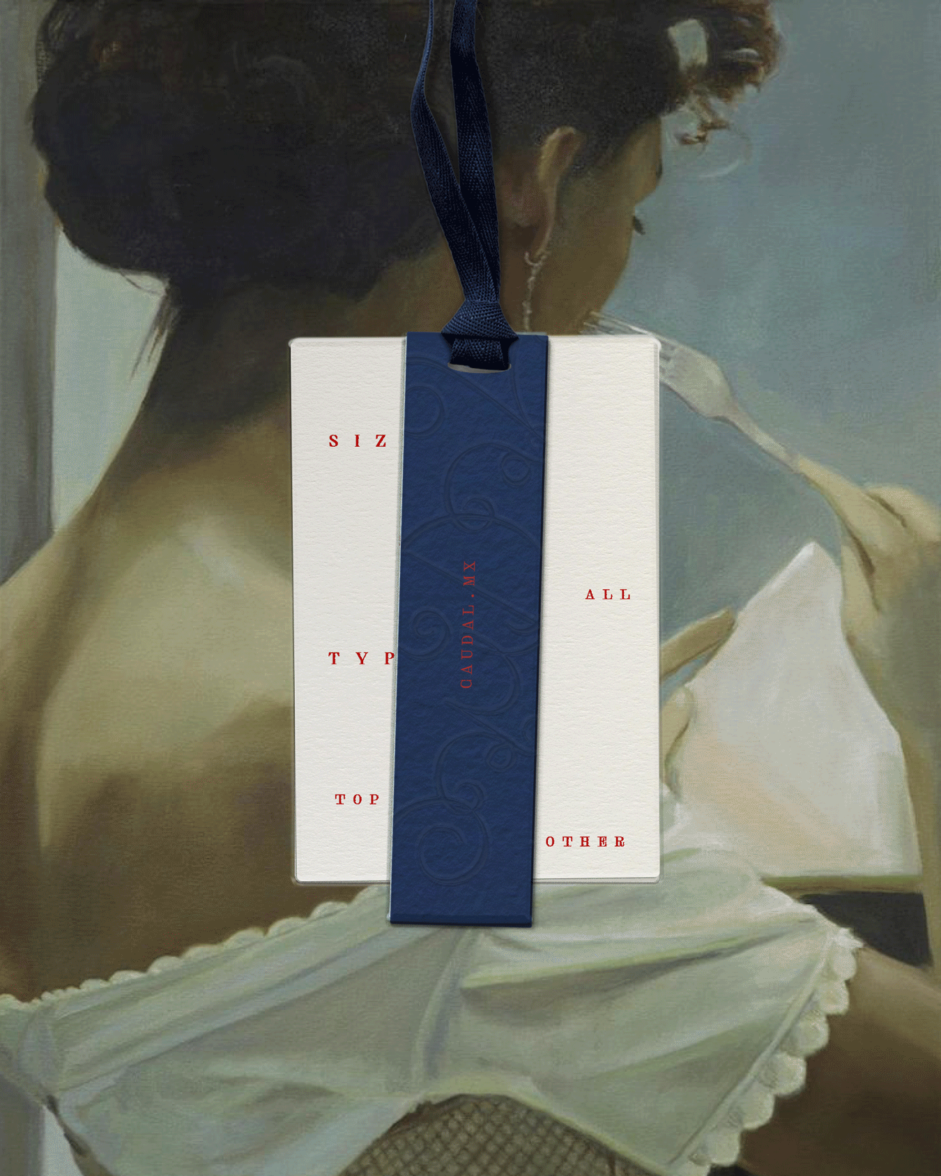
Caudal,
Concept, Creative Direction, logo and system design, label design, packaging
Caudal: A playful current
Caudal means the strength in which the water flows: part of the universe that exists in the mind of the Mexican designer Fernanda Ortega.
This brand explores the concept of femininity through playfulness. It is always learning and always changing.
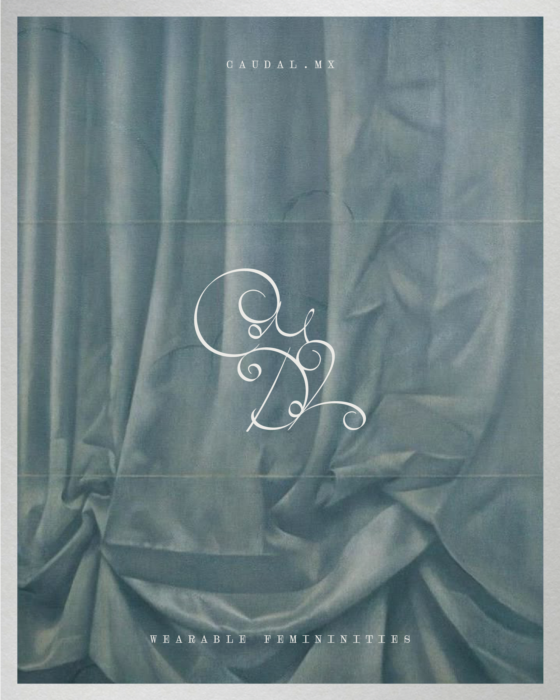
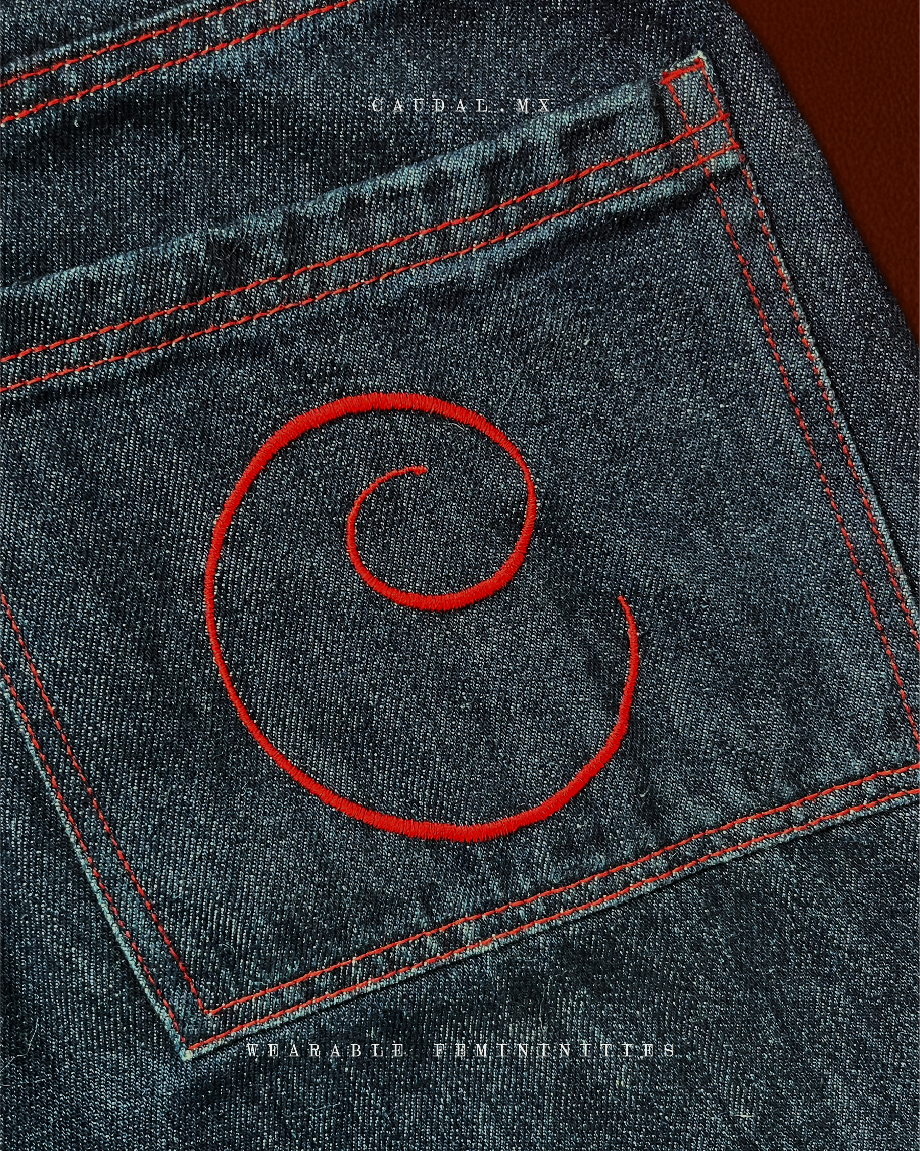
I created a hand-drawn logotype that plays with legibility, romance, and fluidity — reinforcing the idea of feminine exploration through play.
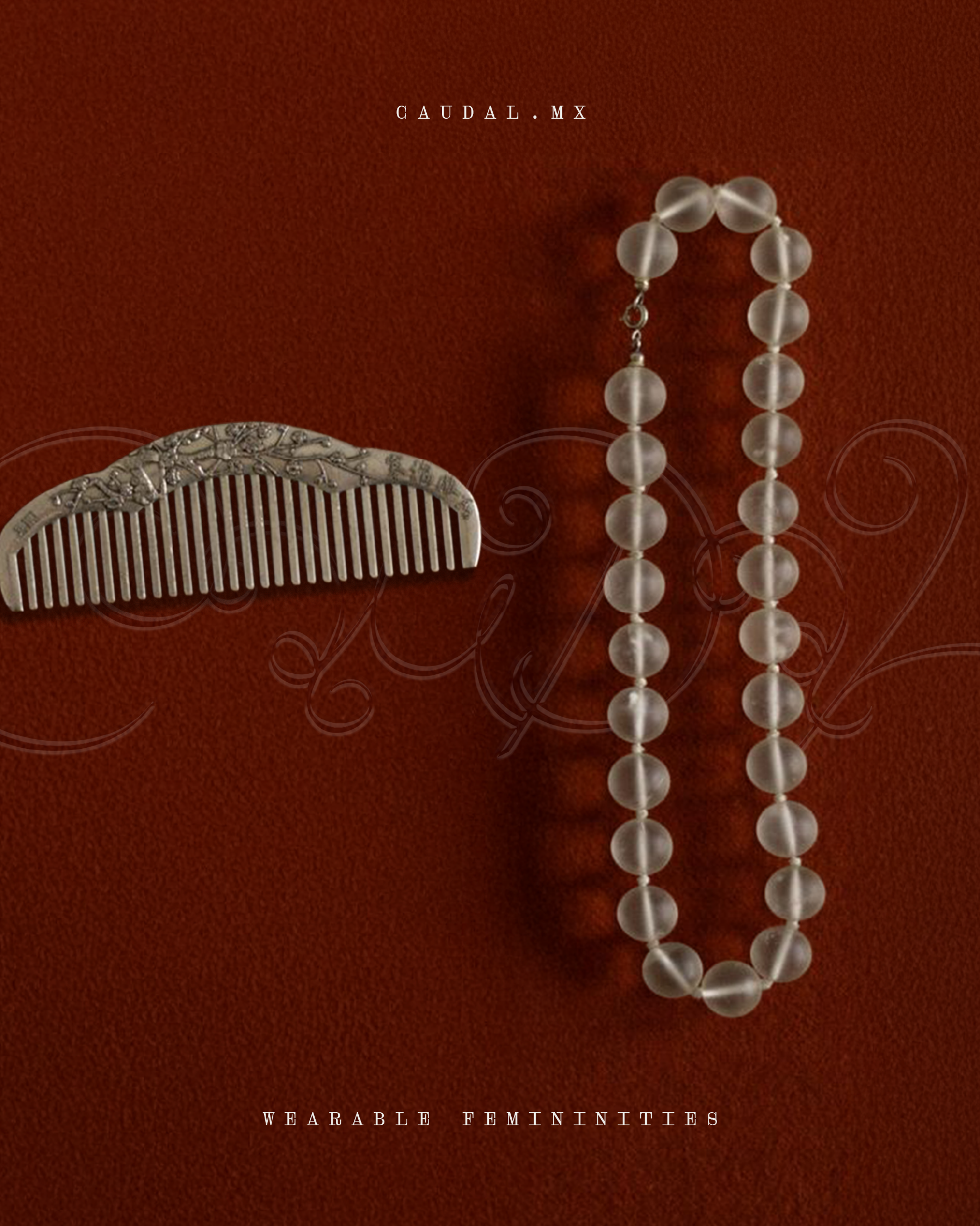
The monogram works as an abstract signature.
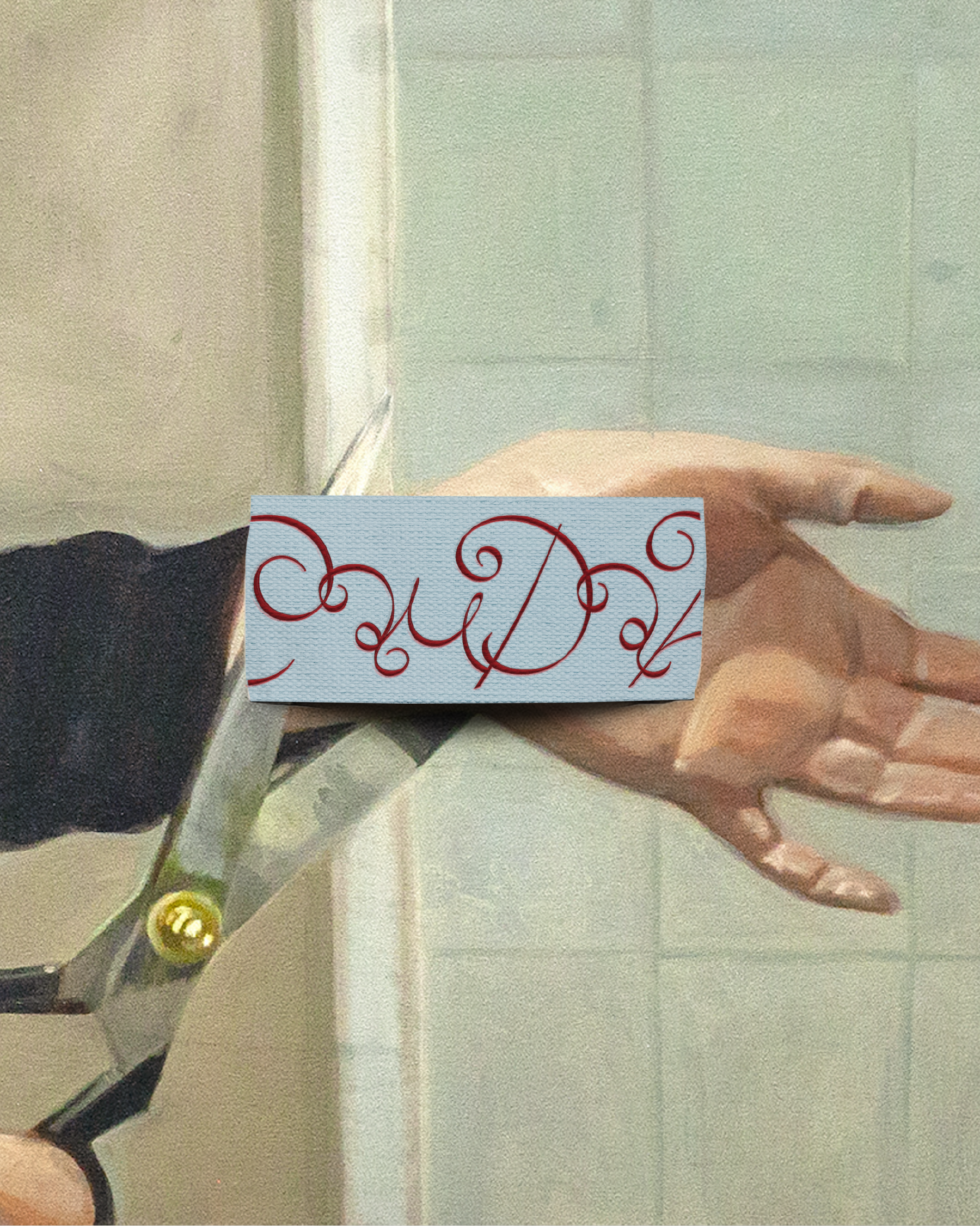
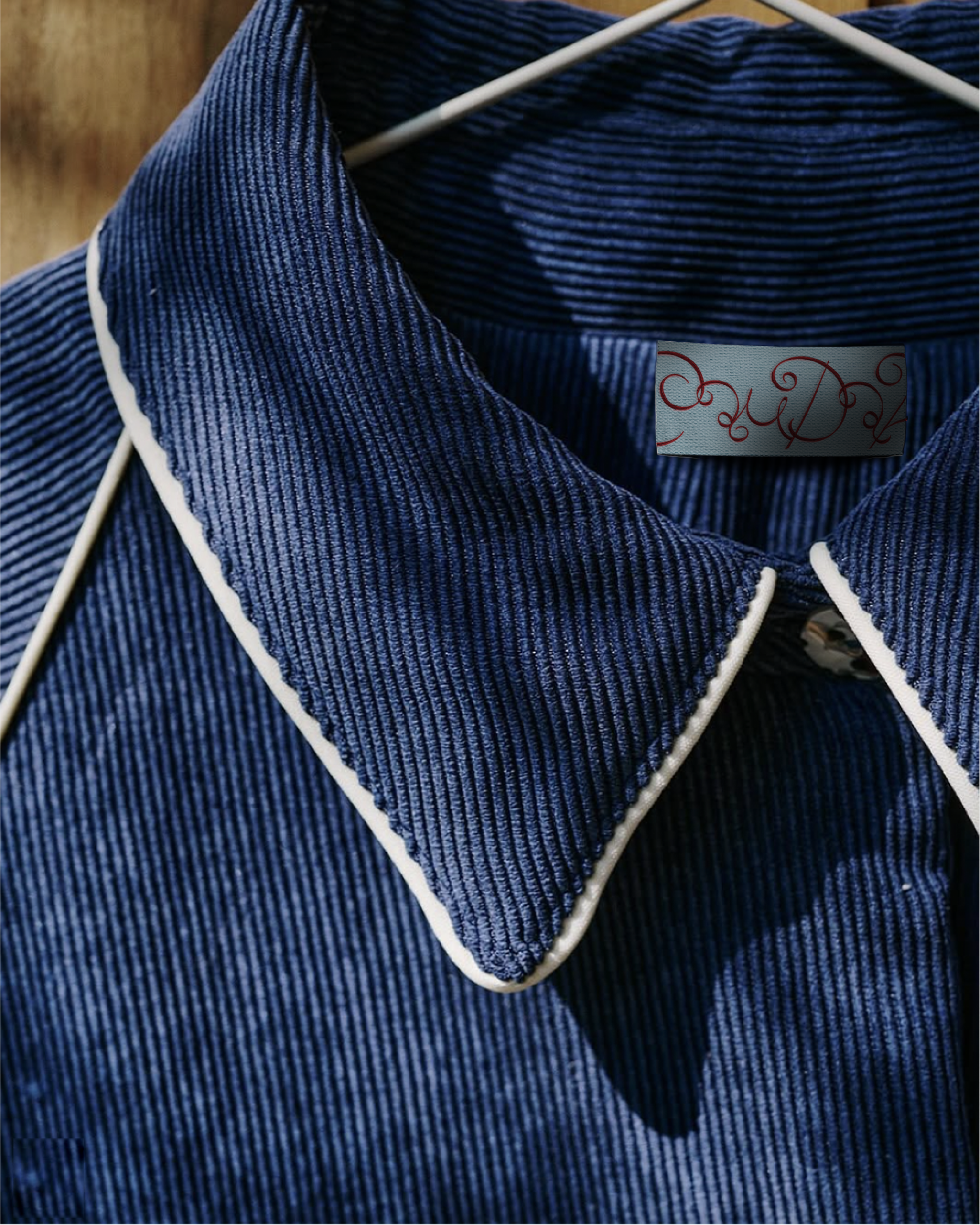
The ‘C’ became a standalone graphic element, used independently — printed and applied across various pieces.